We use cookies to improve your experience on our platform. By clicking “Accept all cookies”, you agree to the storing of cookies on your device to enhance site navigation, analyze site usage and assist in our marketing efforts.
Cookies required for basic website functionality.
Cookies used to deliver content most relevant to you and your needs.
Cookies used to deliver content most relevant to you and your needs.
Cookies that help understand the performance of the website, how users interact with it and to identify bugs.
How is Zeffy free?
How is Zeffy free?
Zeffy relies entirely on optional contributions from donors. At the payment confirmation step - we ask donors to leave an optional contribution to Zeffy.
A logo is a simple image that serves as your organization's visual identity. It is the first impression of your nonprofit, differentiating your organization and communicating your core mission and values. A logo acts as the public face of your brand across various channels.
In short, it does a lot for your nonprofit branding, and it's extremely important to get it right.
In this guide, we'll explore how to design impactful nonprofit logos that represent your organization’s identity and mission. We’ll highlight the key elements of a perfect logo and showcase seven of the best nonprofit logos to inspire you.
A professional logo signals commitment to your mission and shows donors and supporters you're serious about making a lasting impact.
Increases brand recognition
A memorable logo helps people to quickly identify your nonprofit and is crucial for building long-term relationships with supporters and beneficiaries.
Communicates your mission
Your logo should visually represent your cause. It's a quick way to convey what you do and who you serve without words.
Differentiates you from other nonprofits
In a crowded nonprofit landscape, a unique logo helps you stand out from other similar organizations.
Creates an emotional connection
A well-designed logo can evoke feelings that resonate with your cause, inspiring people to support your mission.
Enhances fundraising efforts
A strong logo adds professionalism to fundraising materials. It can make your appeals more compelling and trustworthy to potential donors.
Improves marketing effectiveness
Your logo is the foundation of your marketing efforts. It creates consistency across all channels, reinforcing your brand with each interaction.
What makes a good nonprofit logo design
Align with your mission
Your design should reflect your mission and values. The imagery, symbols, elements, and words should align with the cause your organization supports.
The Humane Society of the United States logo exemplifies mission alignment with its design. Featuring a U.S. map filled with animal silhouettes, it instantly conveys their nationwide animal protection efforts. The organization's name reinforces their commitment to animal welfare across America.
Simplify the design
When designing your nonprofit's logo, focus on one distinctive element that captures your organization's essence. Remember, most viewers won't take the time to study your logo. They will likely glance at it for just a second or two before scrolling away.
A simple design is easier to recognize and remember, making it more effective for communicating your message to as many people as possible.
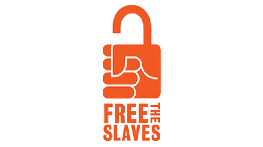
FreeTheSlaves' logo embodies simplicity - A fist-shaped padlock instantly communicates their fight against modern slavery. This single, powerful symbol paired with their name creates a compelling visual representation of their mission.
Choose colors strategically
Colors are critical in communicating your brand’s personality and mission. Each color is associated with certain meanings and emotions, and you should choose the colors for your logo based on the feelings and associations you want to evoke.
For instance, if your nonprofit is dedicated to environmental causes, using green is a good idea, as this color is often connected with the earth, growth, calmness, and harmony.
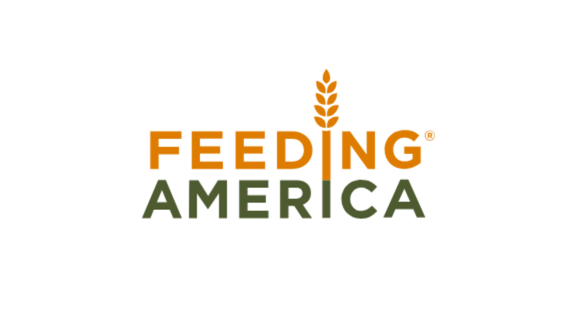
Ensure that the colors work well together and maintain good contrast for readability. A good example is Feeding America's logo, which combines green and orange color schemes with the organization's name written in bold letters. The green symbolizes growth and renewal, while the orange represents the fight against hunger.
Craft a concise tagline
A concise tagline, consisting of 3-7 words, succinctly describes your nonprofit's mission and enhances your logo's impact. A well-crafted tagline also adds clarity and reinforces your brand message.
For instance, Mind's logo – for a better mental health tagline communicates the nonprofit mission – extending support to people struggling with mental health issues.
Don't add a tagline just for the sake of it. See if it fits well with your logo, and consider asking the following questions before deciding:
Is it original?
Will it evolve with your nonprofit?
Is it easy to understand?
Does it add value to your logo?
Create timeless appeal
Design your logo with longevity in mind and avoid trendy elements that quickly become outdated. As a nonprofit, you should focus on timeless design principles and consistency with minimal alterations over time. Your logo should remain relevant and recognizable for at least a decade.
The World Wildlife Fund (WWF) logo has been in use since 1961. The black-and-white panda logo, with its strategic use of negative space, is a perfect example of a classic and timeless design.
Ensure versatility
Your logo must look good in different formats and mediums—online, in print, or on merchandise. It must also look clean and crisp, whether it's displayed on the side of the car or printed on a business card.
Create scalable versions (vertical, horizontal, icon-only, with/without tagline) that maintain clarity at any size. Avoid small text or intricate details that may become illegible when scaled down or viewed from a distance.
Check Operation Smile’s logo: It's clean and adaptable, making it easy to print in color or black and white. It’s also simple to repurpose for different types of channels.
Select legible typography
Choose typography that complements your design and reflects your brand personality. Serif fonts convey tradition, while sans-serif fonts project modernity. You should also ask your team for their opinion on which font best aligns with your mission.
Prioritize readability across all sizes and formats and avoid ornate typefaces that may obscure your organization's name.
Your nonprofit's name is the foundation of your logo, and you should choose a compelling name that reflects your mission.
A strong name inspires creative visual elements, allowing for unique logo designs. Ensure your name resonates with your audience, is easily pronounced, and has visual potential.
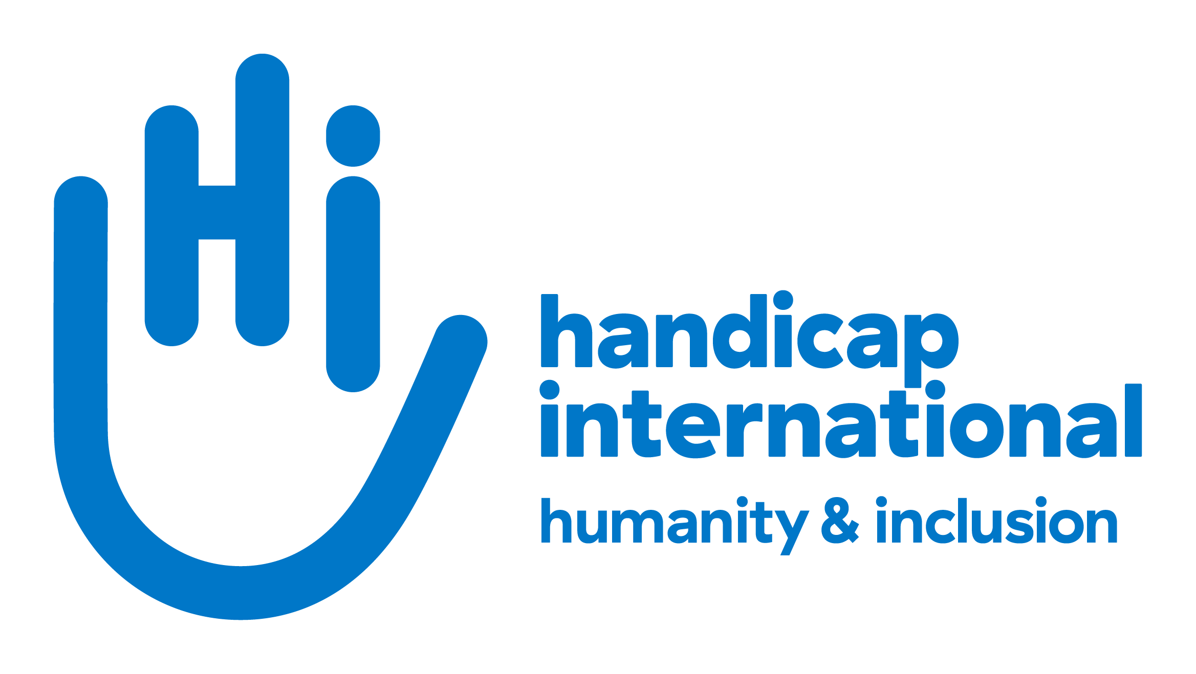
For instance, the Handicap International logo cleverly uses the organization's initials "HI" to form a hand illustration, effectively representing their mission in an innovative, single graphic.
Logos come in several types, each serving different brand purposes. Choose a type depending on your name, persona, and the message you want to convey.
Wordmark
A text-only logo with a stylized typeface is a good option if your name is unique and you want to build brand recognition through it. The wordmark logo is formal, professional, and classic.
Lettermark
The lettermark comprises initials or abbreviations of the brand name in a stylized font. Nonprofits with long or multi-word names might consider the lettermark logo, which can be professional, sophisticated, and modern.
Pictorial mark
A pictorial mark uses a single graphic icon to represent your brand. It's ideal for creating a recognizable symbol that conveys your mission at a glance. This type of logo excels in simplicity and universal appeal, making it memorable to diverse audiences.
Combination mark
Combining a wordmark and a pictorial mark or mascot offers flexibility, as you can use the logo in parts or as a whole. The combination logo is dynamic, trustworthy, and versatile.
3. Define the key design elements
Your logo is a key part of your nonprofit's overall brand identity and should align with other branding elements to maintain a consistent brand image. Use your brand guidelines as a base to define the key visual elements of your logo.
Color
The golden rule of graphic design is to use no more than three colors, as too many colors in a logo can muddle your design. Choose a dominant tone (brand primary color) and one or two secondary shades that complement it.
Fonts
Choose a font that aligns with the organization's existing branding. If your nonprofit name consists of two or more words, you can select two different typefaces to make the design more interesting. You need to ensure that both typefaces complement each other well.
Shapes
Shapes in logos serve both aesthetic and functional purposes, and enhance visibility and adaptability across platforms.
Each shape conveys specific psychological meanings:
Circles suggest unity
Squares imply stability
Triangles indicate direction
Choose shapes that reflect your nonprofit's values and goals.
Check our guide to learn more about nonprofit branding (add the link once it's published)
4. Design your logo or hire an expert
You have two choices: design your own logo or get the help of a professional designer. The first option may seem like a sound idea, but it eventually leads to more time investment and complications down the line. Professional designers or agencies will have the skills and expertise to ensure your logo is technically and visually sound.
To save on costs, look for freelancers or design students interested in building their portfolios. You can also check if any of your volunteers have graphic design skills and might be willing to create your logo for free.
Remember, your logo will be the primary identifier for your nonprofit for years to come. It deserves careful attention and thoughtful design.
5. Review, refine, and design variations
Look over the final design for any errors, big or small. Ask your board members, volunteers, and employees to review your logo and help catch errors or suggest improvements.
Key aspects to review in your design include:
Check carefully for any spelling errors. Ensure the colors and fonts used in the logo match your nonprofit's brand guidelines.
Ensure the logo accurately represents your organization. Show it to someone unfamiliar with your nonprofit and ask for their interpretation of the design.
Test your logo's versatility by using it across different channels. Add it to social media posts and email signatures to check its appearance at various sizes.
See how your logo looks in black and white. Is it easy to understand? Can you see all the design elements? If not, redesign it.
7 inspiring nonprofit logos to spark your creativity
Oxfam is a confederation of twenty-one charitable organizations. Its logo is one of the best in the nonprofit sector—simple yet distinctive.
The logo's unique pictorial mark consists of the letters O and X. It resembles a stylized human figure, representing Oxfam's workers and the people they help.
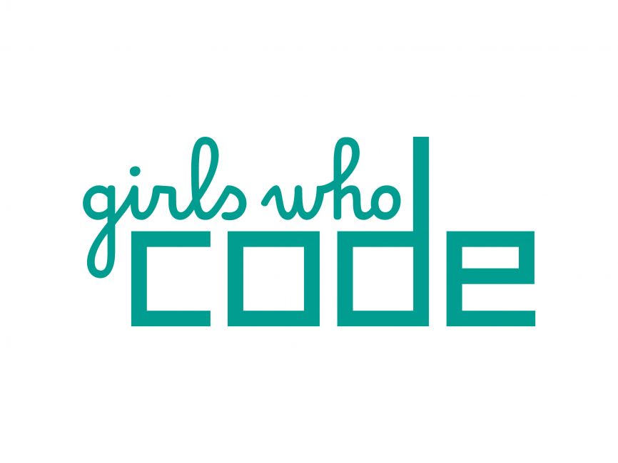
2. Girls Who Code
The Girls Who Code design is an excellent example of a classic and timeless logo that's well-balanced. With the phrase "girls who" sitting above "code," it looks neat and clever. The typography enhances this balance: the flowing, cursive style of "girls who" complements the bold, square letters of "code.”
3. YMCA
YMCA, often called the "Y," is based in Geneva, Switzerland, and helps young people advance worldwide. Their organization’s logo features a stylized letter “Y” and a dynamic, forward-leaning shape.
The color palette includes bright, energetic hues like blue and magenta. This design emphasizes inclusivity, growth, and forward-thinking, reflecting the YMCA's evolving commitment to community and wellness.
4. Charity: Water
Charity: Water is a nonprofit organization that provides clean drinking water to people in developing countries. Its logo is a clear representation of the nonprofit’s mission, featuring a jerrycan commonly used by those in need to carry and store water. Yellow in the logo represents hope and a brighter future, and white symbolizes purity.
5. Cancer Research UK
Cancer Research UK is one of the world’s leading cancer research organizations. Their logo design is simple, clean, and professional, reflecting the organization's commitment to excellence in the medical sector.
There is also a spark of creativity that you can see in the stylized letter C, designed in a big, colorful way with multicolor dots. These simplified circles symbolize special moments in the journey to beating cancer. The logo is mostly blue with a hint of pink and gray that together indicate trustworthiness, authority, and compassion.
6. The Water Trust
The Water Trust is another nonprofit organization that provides clean water and sanitation programs in East Africa.
The organization’s logo is cleverly designed to highlight its purpose, converting the A and U into a stylized drop of water. This creative design, while standing out, maintains readability. The logo has two tones of blue, representing water, of course, trustworthiness, and stability.
7. Goodwill
Goodwill is a nonprofit career training center that helps people find jobs and learn new skills in their local areas. Their logo is brilliantly designed, with the letter “g” cleverly forming a smiling face.
You can see the “g” twice: once as the face and once in the word “goodwill.” The smile sparks a feeling of happiness, helping the organization project a positive image. Blue and black evoke trust, while white gives a sense of hope.
Concluding thoughts on creating a good nonprofit logo
To design the perfect nonprofit logo, revisit your core message, learn the basics of branding, and explore other designs in the nonprofit landscape. Ensure that your logo is simple yet unique, with elements conveying your nonprofit's mission at a glance.
Whether you're just starting a new nonprofit or going through a rebranding process, put thought and effort into developing a unique and memorable logo.
Zeffy offers 100% free fundraising tools to support your nonprofit's establishment and growth. By reducing initial costs, allocate more resources to develop a compelling visual identity that embodies your mission.
Knowing when to stop can be one of the biggest challenges in logo design. It’s easy to get carried away trying to include every detail about your nonprofit in your logo but fitting everything into a tiny logo is impossible.
While designing your logo, avoid these common pitfalls and set yourself up for success:
Using clipart or generic images can make the logo look unprofessional
Adding too many elements or intricate details
Using hard-to-read fonts or too many different typefaces
Using too many colors can make the logo visually overwhelming
Following design trends that can quickly become outdated
Using low-resolution images that look pixelated or blurry
Yes, your logo should be a vector as you will need different sizes and types. It offers versatility for both print and digital use across various channels.
Vector files, such as those in Adobe Illustrator (AI) or SVG (Scalable Vector Graphics) formats, are scalable without losing quality. This ensures that your logo looks professional and sharp at any size, from business cards to billboards. They are also simple to manipulate for different uses, such as color changes or resizing as needed for various printing materials.
Yes, it's advisable to trademark your nonprofit logo and name. A trademark helps protect your brand from being used by others, ensuring exclusive rights to the name and logo.
Trademarking your name increases branding awareness for the public, making it easy for them to identify your nonprofit and differentiate it from others. Once trademarked, you have better control over licensing your organization's name and logo for marketing and fundraising purposes.
Ready to start making an impact in your community? Learn how to start a nonprofit using these steps, plus discover how you can do it all for free with Zeffy.
Look for people who attend related events, follow relevant Facebook groups, or subscribe to aligned newsletters.These aren’t just potential donors—they’re your future advocates.
Look for people who attend related events, follow relevant Facebook groups, or subscribe to aligned newsletters.These aren’t just potential donors—they’re your future advocates.


.webp)

