We use cookies to improve your experience on our platform. By clicking “Accept all cookies”, you agree to the storing of cookies on your device to enhance site navigation, analyze site usage and assist in our marketing efforts.
Cookies required for basic website functionality.
Cookies used to deliver content most relevant to you and your needs.
Cookies used to deliver content most relevant to you and your needs.
Cookies that help understand the performance of the website, how users interact with it and to identify bugs.
How is Zeffy free?
How is Zeffy free?
Zeffy relies entirely on optional contributions from donors. At the payment confirmation step - we ask donors to leave an optional contribution to Zeffy.
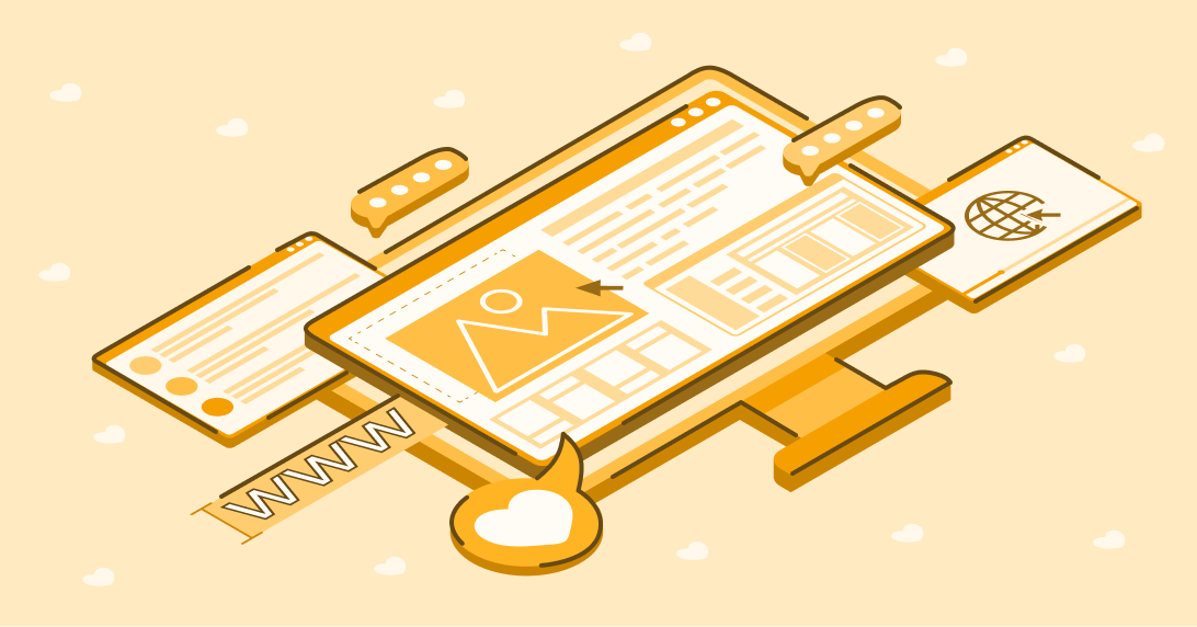
Your nonprofit website can make or break a visitor’s decision to take action. Whether people want to donate, volunteer, fundraise, or attend events, your website is likely their initial point of contact.
Attracting high website traffic requires the right balance of a professional appearance, exceptional user experience, and intuitive navigation. It will take some creativity to stand out in a digital landscape populated by over one billion websites worldwide.
Fortunately, you don’t need extensive coding knowledge or a substantial financial investment to make it happen. Your nonprofit organization website can thrive by effectively engaging supporters, building trust, and inspiring involvement.
So, what makes a great nonprofit website? We've covered everything you need to know below, including:
The critical nature of a nonprofit organization website
Your nonprofit website is the foundation of an increasingly important online presence. The Internet's global reach allows you to engage with donors, partners, and volunteers anywhere.
On average, nonprofits see excellent traction from their websites, with 12,708 visitors. Focusing on the impression you’re making with every page and word choice is the simplest way to build your connection to your community, build awareness, and drive your mission forward.
Your nonprofit website can capture traffic from a variety of channels, such as:
Your social media profiles, bio, stories, and ad links
Emails and personalized outreach
Google ads or organic search engine optimization (SEO)
Getting a supporter to land on your site through marketing and promotions for your nonprofit website is a great first step. The ultimate goal is to deliver an experience that keeps them there to engage with your content and take action.
An excellent nonprofit organization website experience can help you:
Capture more donations to various campaigns
Acquire donors with your story and a clear call to action
Retain donors with new ways to give and get involved
Whether you're considering revamping your site or creating one for the first time, we've got you covered. Let's jump into the factors that make a nonprofit organization's website stand apart.
How to build a nonprofit website that boosts fundraising
Accessibility: Your nonprofit website should make everyone feel welcome and included throughout their experience. Thinking about those who have disabilities or impairments can help you design pages that encourage their full engagement.
Accessibility broadens avenues for visitors to interact with your website, from accessing vital resources to participating in events to making donations. This is a simple yet largely impactful priority, given that only 22% of nonprofits have websites designed for those with visual and hearing disabilities.
A thoughtful design: Your website is like a window into your nonprofit, so the look and feel matter. You want supporters to understand your organization's personality and human touch while building trust through a professional brand.
As you describe your work, goals, and story, you can introduce a layout that's easy to follow and keeps readers on the page.
Simple navigation: When considering design, think about functionality alongside aesthetics. After all, people can't engage with what they can't find.
Navigation on your nonprofit's website should help people find the most essential information, such as a donation form, volunteer application, or about page, without struggle. This is where your menu, buttons, headers, and footers will play (more on that below).
What should a nonprofit website include?
It’s helpful to see the most common website sections to choose which to focus first. Here are a few that can help you see the most value from your online presence.
Page header: The top of your website, where you'll place your logo and website menu. This is often where a visitor's eye might go first, so choose colors and sizing that make it pop.
Menu: A simple place for visitors to click and see your most important web pages at a glance. Your menu can help people move around your site quickly and find what they came for.
Home page: The first place people land when they visit your website, featuring an introduction to your mission. This is where you want to tell your story, showcase compelling imagery, and feature buttons to drive people to the actions you want them to take.
About page: A place to expand upon your founding story and pull people in to want to be a part of it. Share details about how your mission came to be and the impact your nonprofit has had with the help of your community.
Donation page: The place where visitors can access an easy donation form and complete a transaction. You can include various options and giving levels that support conversion.
Events page: If your nonprofit has events (both virtual and in-person), you can feature them in one easy place to boost registrations. A simple registration form can help you reach more attendees and raise more.
Fundraising page: You might offer peer-to-peer fundraising opportunities to encourage people to get involved without a direct donation. A straightforward way to get involved can help more people advocate for your cause.
Membership page: Nonprofits who build loyal donor relationships with recurring donations or memberships can feature a page specific to those programs.
Digital storefront: More nonprofits are offering eCommerce options to raise money. Feature your shop link through your website to help people find it and make a purchase.
Footer: A simple way to stay in touch with website visitors after they find what they're looking for. You can add contact information, social media handles, and links to subscribe to a newsletter that will appear on every page someone visits.
The easiest way to capture donations is to add an easy-to-find donate button when someone lands on your site. Consider featuring a donation button in areas like your header or the first section of your home page.
When someone arrives on your website, you want them to know where to give without getting too lost in other content. People may only abandon your site partially with a straightforward way to give, resulting in a lost opportunity to raise more.
Tips for a strong donation button:
Use contrasting colors between your button and text.
Ensure your button stands out against the background you place it on so it's not easy to miss.
Use simple and short calls to action such as "give now," "donate here," or "start a donation."
Help people quickly understand your cause and why their support matters. Any ambiguity can risk confusion or uncertainty about where donations go, so be sure to offer clarity and be proud of what you’re doing.
When discussing your impact, avoid using vague terms or overexplaining. It's best to be concise and provide details that help people envision their dollars being transformed into the change they hope to see.
A good rule of thumb is to include:
Who you are
Why you do the work you do
Where you're located
Who you serve
Which projects you're working on
Milestones and celebrations
You can also display your impact through visuals that bring even more clarity to your readers.
Think about design elements such as:
Imagery to compliment your text and aid skimmers
Videos that can share information that would be too text-heavy on the page
Text and font variations that call out keywords and phrases
Almost 66% of online traffic came from mobile devices in February 2024. Having an online presence requires an assumption that most visitors will access your nonprofit's website from a mobile device at one point or another.
Especially when you think about a website for nonprofits that drives traffic from social media, a mobile-optimized experience is a must.
Tips to mobile-optimize your website:
Responsive design: Adjust your layout to fit various screen sizes and orientations depending on the device used.
Optimize load time: Compress image and video sizes and reduce unnecessary plugins that might slow down the experience.
Simplify your navigation: A clean and intuitive structure like the ‘hamburger’ style menu works universally.
Check on font and text sizes: Make sure your headers and body text remain legible when they're condensed to a mobile screen.
Use touch-friendly elements: Make sure buttons, links, and other interactive elements are large enough and spaced adequately to be easily tapped with a finger.
Minimize pop-ups: Avoid an intrusive user experience that blocks the whole screen on mobile devices. Many sites have settings to turn this off specifically for mobile users.
Keep forms brief: Simplify the number of fields and use quick input methods like dropdowns to help people complete them on a mobile screen.
When you've designed your site or added new elements, testing it on several phones and browsers is always a good idea. That way, you can catch bugs before they become barriers to your supporters' actions.
After you've hooked people, it's time to show them why their donation matters. Donors get involved with charitable causes to make an impact, so it's important to clarify that on all pages.
While you can tell potential donors about the impact they can make, it's much better to show them. Help visitors envision the outcome of each dollar they contribute to foster deeper connection.
A few creative ways to display your impact:
Offer a direct tie between specific giving levels and tangible outcomes (ex., Every $10 donation feeds a family in need)
Showcase stats (ex., $1 million raised to provide 460 communities with clean water thanks to your donations)
Display images that showcase results (ex., The completed construction of a school, a family at peace in a secure shelter, students with a tuition acceptance letter in their hand)
Share testimonials or a letter from someone who's received the benefit of donations
Give donors options to get involved
When your visitors are ready to give, the last step is to ensure they have plenty of options. The more opportunities you offer, the more likely they will be to take action and join your community.
Depending on your fundraising strategy, you can choose the most impactful ways people can get involved and elevate those across several places on your website.
Here are some ways to showcase your giving options:
Keep a donate button in your website header visible as people navigate various pages.
Add dedicated website pages for specific giving options and feature them in your navigation menu (ex. "Create a Fundraiser" and "Join Us at an Event.")
Create a single landing page titled something like “Ways to Give” to feature all options at a glance.
Feature strong call-to-action buttons that entice people to give on pages that share more information about your organization (ex. Help us achieve more results like these by giving today”).
Make sure donation forms are ready to convert
With any giving options, you want to ensure supporters have a consistent and straightforward path to complete a donation or transaction.
Here's a brief checklist to make sure you capture every interested donor as a completed donation for your cause:
Simplicity: Your online donation forms only ask for necessary information from users, so they spend little time and can give quickly (name, email, phone number, address, etc.).
Customized questions: When applicable, mark questions or form fields on your donation forms as 'optional' or ‘required' to add clarity.
Preset donation amounts: Suggest specific giving amounts on your donation form to show up by default and guide donors with an option also to choose how much they’d like to provide.
Modern payment options: Help donors complete their transactions or donations using major credit cards, Apple Pay, Google Pay, ACH bank transfers, pre-authorized debit (PAD), and other flexible options they may already have in their mobile wallets.
The best way to spark creativity is to see examples from other nonprofits. From the best nonprofit website design to content that pulls on our heartstrings, the following examples are sure to inspire.
If someone is ready to give or start a peer-to-peer fundraiser at any point in their experience on Kids Cancer Care's website, they can immediately click to take action. They can also navigate the menu with a personalized experience for both families and supporters.
Inspiration for your nonprofit website:
Include multiple buttons in contrasting colors to drive action to the highest priority initiatives.
Play around with a fun sidebar callout to new programs or a secondary call to action.
Include a visual that reminds people why their actions matter with a compelling headline to reiterate that impact.
Use a color palette that naturally draws the eye to where you want people to look first.
Appeal to different audiences in your menu with personalized drop downs (ex. “For Families” and “For Supporters”)
2. Dear Future’s impact-driving nonprofit website
Within seconds of visiting Dear Future's website, you're instantly greeted by a pop-up that prompts you to participate in the organization's priority campaign. A strong image and an enticing donation button help people see what the most impactful action might be.
If you opt out of the pop-up window and continue exploring their homepage, Dear Future does an excellent job of showing which programs are taking place and how many individuals have benefitted from them.
Inspiration for your nonprofit website:
Try out a pop-up when you have a more time-sensitive campaign or need to boost donations quickly.
Include your impact report and strong numbers that showcase your accomplishments to entice more donors to join the mission.
Consider using vibrant photos that show the impact and robust numbers that build trust among supporters who want to see where their gifts go.
Explain the programs you've got going on to appeal to individuals who might be called to one area of impact and decide to take action.
3. True North Housing Alliance’s personalized nonprofit website
True North Housing Alliance invites visitors in with thoughtful and personal imagery that simultaneously showcases why this work matters and pulls on emotions.
A strong headline and can't-miss donation button with thoughtful text help to prompt gifts immediately.
Inspiration for your nonprofit website:
Try out a bold color for your donate button to grab attention fast.
Replace stock images with authentic and personal photos to build relationships.
Tell people who you are and what you do with short and human-centric text.
Design navigation titles around people's curiosity, such as "What We Do" and "Take Action," to leave out any ambiguity.
Bee University welcomes website visitors with creative branding that draws you down each page to learn more. Among these well-designed pages is the About page, where simple language meets proof of concept with a featured Platinum Transparency award from Candid.
The pairing of simple language and color blocks drives engagement, which helps people continue scrolling and absorb everything on the page.
Inspiration for your nonprofit website:
Offer a timely invitation in an announcement bar that stands out against your header image.
Create natural breaks in your text and image blocks to make your pages feel less daunting.
Be bold about adding awards to pages where people want to confirm their donation is going to a good and reputable cause.
Create design elements that break away from horizontal lines to draw the eye down the page.
Anyone, on any device, can share the engaging experience of Outreach360's website. There's no doubt about where to take action on this site, with call-to-action buttons that jump off the page and a header full of go-to links.
Visitors can read a few simple words in Outrach360's header to gain all the clarity they need about the organization's work.
Inspiration for your nonprofit website:
Create a mobile-specific layout for your images and text displays on smaller screens.
Lean into a hamburger-style menu that reduces scrolling on a phone or tablet.
Provide all critical information someone may need in your header to build relationships quickly while offering more options to continue exploring for those interested.
Include accessibility features like a preferred language option that help more people feel a sense of belonging and comfort while they explore your website.
6. Noelle's Gift to Children's heartfelt nonprofit website
Arriving on Noelle's Gift to Children's home page is like meeting a new friend. The tone is friendly and inviting, helping people feel the importance of their role in the organization's mission to improve the lives of children.
Instead of flooding their home page with information and lengthy text, Noelle's Gift to Children uses a personal video that introduces the mission's purpose.
Inspiration for your nonprofit website:
Use video to communicate a message you don't want people to miss in a way that feels like a conversation.
Avoid autoplay on video settings to support accessibility for those with disabilities.
Showcase your mission so it stands apart from other content on your home page.
Add opportunities to donate and take action from any section that speaks to visitors.
#YesSheCanCampaign's website is a unique surprise of pink that calls you in on the home page. The color palette lends itself to a softer, more inviting feel that carries through to their shop and donation forms.
The website delivers an approachable learning experience. Visitors can find the campaign's key focus areas, programs, and impressive corporate partners without leaving the home page.
Inspiration for your nonprofit website:
Own your unique branding so people can experience it on every page they click.
Add your eCommerce shop link to your header to give people more ways to support.
Feature awards that reiterate the legitimacy of your organization and create confidence among supporters who want to get involved.
Make a splash with any team fundraising or corporate partnerships to help build momentum.
Brand your donation form to match your website with preloaded donation amounts to offer a smooth transition in the experience and entice giving.
8. Big Brothers Big Sisters of St. Thomas-Elgin's storytelling nonprofit website
It's hard not to gravitate towards Big Brothers Big Sisters of St. Thomas-Elgin's website with intentional imagery and a sleek feel. The choice to open the site with a black-and-white image of a child and bright buttons makes this site action-oriented from the jump.
Below the header, visitors can explore unique elements such as the latest news about the organization and stories from the community. By featuring real-time storytelling, supporters have a first-hand encounter with the impact they're contributing to.
Inspiration for your nonprofit website:
Experiment with black-and-white photography and pops of color reserved for call-to-action buttons, like this site does, to drive donations and volunteer applications.
Incorporate a slideshow header that adds an interactive element and guides people to various programs they may be interested in.
Bring storytelling to the forefront by asking community members to share their experiences and photos.
Feature your newsletter and social media links in the website header to help people stay in touch even if they don't decide to give it immediately.
It only makes sense that Y'all has a website that's as inviting and diverse as its mission: to make affirming care accessible to all and to support and encourage authentic living. This website greets you with an animated header and a video that brings fun energy and an unforgettable experience.
Y'all use bright colors and unique branding to call people in and show them how to make an impact with clear action buttons. From donating to attending events and shopping, visitors can find every way to get involved with a few scrolls.
Inspiration for your nonprofit website:
Have fun with your branding and animated elements that bring your website to life.
Let people know how to make a difference for your cause with a few critical calls to action on your home page.
Place your eCommerce, events, and donation opportunities in separate menu tabs to showcase a wide array of giving options to all visitors.
Use video to showcase impact and give people a more intimate way to learn about your work.
Lean into color blocks to separate critical sections of your website pages and help people focus on what they're feeling called to explore more.
10. Community Music School of Santa Cruz's people-centric nonprofit website
Community Music School of Santa Cruz chose a header image for its website that reiterates the people who make its mission possible and the longevity of its organization. Visitors can learn about the rich history they're about to participate in through various learning paths.
Community Music School's upcoming events are prominently displayed for people to engage with and build relationships. They also share testimonials that prompt people to a dedicated reviews page to hear directly from people involved in the programs.
Inspiration for your nonprofit website:
Grab testimonials as often as possible. They're a great way to tell your story through the eyes of your supporters and beneficiaries.
Make it easy to access upcoming events for the highest registration rates from website visitors.
Offer a donate button that's always present in your header and throughout various pages where you're educating your visitors.
Showcase your history and show people they can trust your cause is worthy of their loyal support (ex. "connecting people to music through music since 1992".)
Your nonprofit website is a fantastic tool to attract new donors, nurture connections, and retain loyal supporters and partnerships. Once you’ve worked to design a site you love, Zeffy’s free donation forms can help you continue the experience through the checkout process.
Zeffy is 100% free to use and helps you customize your donation form and other campaign pages to match the look and feel of your website. That way, you help more people complete donations and see every dollar go to your cause.
Get weekly fundraising tips from nonprofits experts
Thank you! Your submission has been received!
Oops! Something went wrong while submitting the form.
Keep reading :
Webinars
Webinar- Online Fundraising: How to Raise the Most on Your Website, Social Media, and More
Watch a free webinar all about online fundraising through your nonprofit website, social media, and email strategy. Learn tangible tips and hacks to reach more donors and raise more for your cause.
Need a nonprofit website but short on time or budget? Explore top website builders and discover how Zeffy helps grassroots nonprofits start fundraising — no website needed.
Look for people who attend related events, follow relevant Facebook groups, or subscribe to aligned newsletters.These aren’t just potential donors—they’re your future advocates.
Look for people who attend related events, follow relevant Facebook groups, or subscribe to aligned newsletters.These aren’t just potential donors—they’re your future advocates.


.png)

.webp)

